MARKETING COMPANY BRANDING
logo / identity
Client: Rochelle Rae, RRM | Role: Design, Art Direction


client desires:
- Bold, Modern, Some kind of potential “character” to represent her company
- Recognizable icon that can stand alone on elements
- Though it’s a female-driven company, wants the logo to have some masculinity added in with the femininity.
solution:
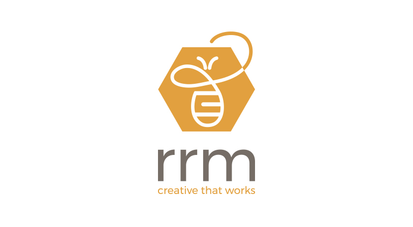
- Stylized contemporary bee icon tucked inside a honeycomb shape has a lot of movement & fluidity, and the bee illustration itself was derived from the cursive “R” in the client’s signature
- The bee & hive originated from the collaborative nature of the company — which is a team of independent contractors who come together on projects. Like bees, they work really hard, business is always buzzing, RRM is the ‘hive’, and Rochelle represents the ‘queen bee’ (client liason / bringing in the projects / overseeing the bigger picture)
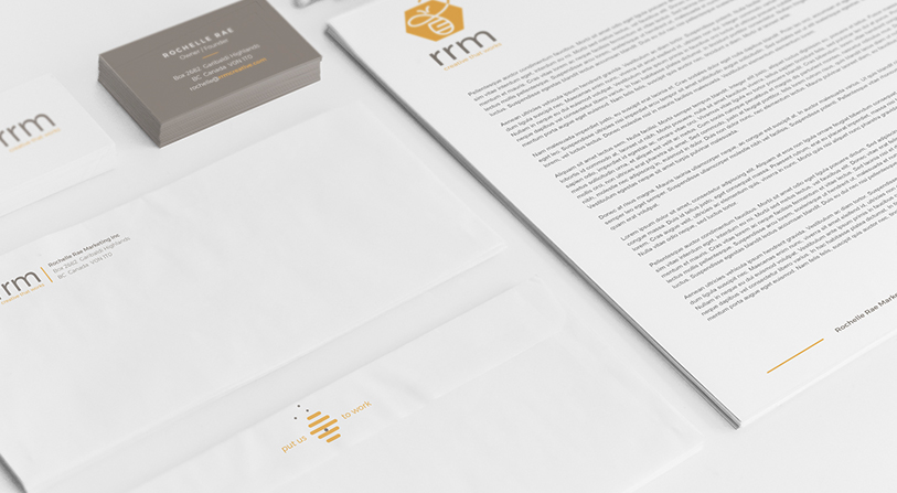
- Additional icon of a bee hive which plays together on various collateral assets
- The rounded shape of the bee has a powerful, yet feminine presence and is combined with a bold honeycomb shape and a more gender-neutral / strong, bold font playing on masculinity and femininity
Ready to chat?
I am available for freelance and contract design work. My rates are negotiated hourly or by project.
