
ARÊTE
logo / identity
Client: Arête Skis | Role: Design, Art Direction | Agency: Classic Ink Creative
Arête is a handcrafted custom ski company in Bozeman, Montana.
client desires:
- Bold, Simple, Modern but somehow integrating a subtle retro surf-lifestyle-type vibe
- Recognizable, standalone icon that can be used on the skis and other collateral
solution:
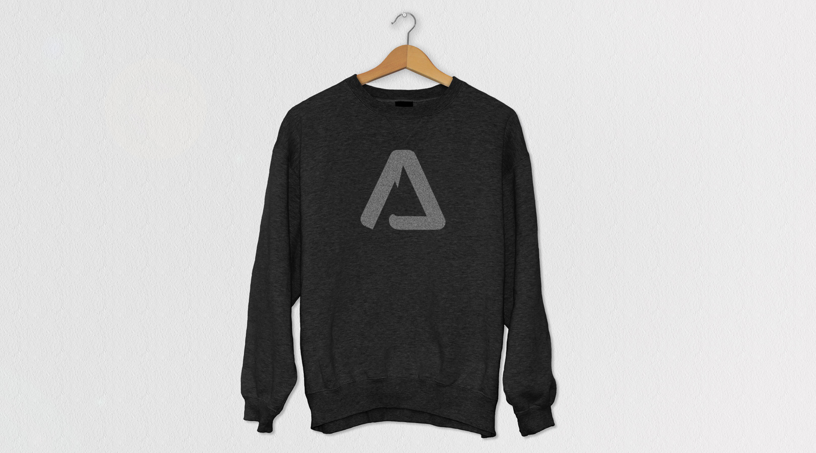
- The icon makes the shape of an “A”, as well as the overall shape of a mountain, combined with sharp jagged edges (quite literally defining ‘arete’ – a sharp mountain range)
- The icon and the ‘arete’ type-style both combine sharp and rounded edges – which makes for an interesting pairing of both contemporary and retro
- Icon works well as a standalone brand and would be recognizable even without the full name attached to it
Ready to chat?
I am available for freelance and contract design work. My rates are negotiated hourly or by project.