
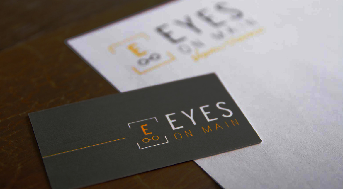
EYES ON MAIN
logo + business cards
Client: Eyes on Main | Role: Design, Art Direction | Agency: Classic Ink Creative
Eyes on Main is an upscale eye doctor’s office located in Bozeman Montana. The client came to us for help with a logo and some business collateral materials. They wanted an upscale unique logo; their biggest concern was not looking like most of the other eye-care companies (i.e.: image of an eye or just glasses). The challenge was how to represent their company in a unique way – our the solution was to get inspiration from something we all know too well, an eye chart.


client desires:
- something unique and fun but with a classy, professional approach
- not the typical eye-doctor logo
solution:
- overall image is an eye chart, the position and size of the symbols below the “E” represent the other rows on the chart, as well as some more subtle symbolism, including:
- a pair of glasses that also represents a car
- dotted lines representing both the smaller letters on the chart as well as the dotted line in a street to represent the location being right “on Main”
- placed inside a bracket which represents the idea of focusing – a familiar process for anyone who has received an eye exam
Ready to chat?
I am available for freelance and contract design work. My rates are negotiated hourly or by project.