
IRON PINE
logo + business cards
Client: Iron Pine | Role: Design, Art Direction
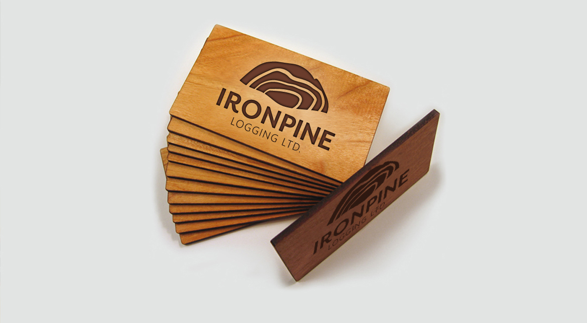
Iron Pine is a logging company located in Montana. The client wanted an abstract but recognizable mark with a masculine quality, something quirky with mark that can be recognized and stand out from the crowd. This logo concept represents a cross-section of the tree-ring patterns on a log & is complete with a masculine sans-serif type treatment.
client desires:
- abstract but recognizable mark with a masculine quality
- something quirky that can be recognized and stand out from the crowd but blend in with brands such as John Deere
solution:
- the logo represents a cross-section of the tree-ring patterns on a log
- paired with a masculine sans-serif type treatment
- simplistic but bold
Ready to chat?
I am available for freelance and contract design work. My rates are negotiated hourly or by project.