
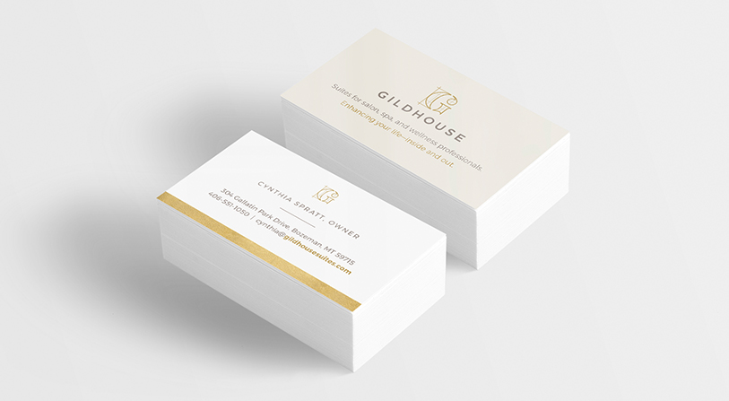
SALON + WELLNESS SUITES
logo / identity
Role: Design, Art Direction | Agency: Classic Ink Creative
client desires:
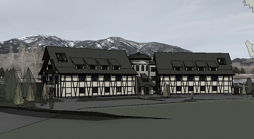
- Something unique and unexpected – the building is inspired by 19th century tudor architecture (which is unique to the area) and the logo should follow through with that
- Needs to feel slightly high-end / luxurious
- Should feel modern and artistic without feeling whimsical
solution:
- Stylized G icon is a real nod to the building architecture – the curves seen in the icon combined with the linear elements are reminiscent of French architecture styles with exposed windows, open spaces
- The icon ‘window’ lines also play off of architectural plans and the whole building concept – as it ends up being a grid of different sizes and spaces which represents the suites/units
- Feels up-scale/elegant with an artistic twist
Ready to chat?
I am available for freelance and contract design work. My rates are negotiated hourly or by project.